January 2022 Logo Remix: Curtis Bullock
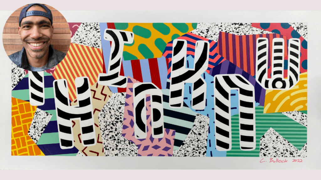
Every month, we invite a new artist to take the ThinkNW logo and make it their own. We asked Curtis Bullock, a local Portland artist, who is also the Principal at Sabin-Schellenberg Professional-Technical Center, to warm us up with some spray-painted pop art this January. In typical educator fashion, he understood the assignment.

How did you initially want to approach your interpretation of the ThinkNW logo? What were your thoughts and inspiration?
I am in a period of some pretty big creative growth at the moment, so the timing of this logo project was really fortunate for me. I was born in 1983, and a lot of my earliest childhood memories are informed by things like Pee-Wee’s Playhouse and an era of brightly colored, durable plastics coming into kids’ toys. I spent a huge amount of time playing with Lego as a kid, so big, chunky colors are deeply ingrained in my memories of my creativity. I also love puzzles, so working within a color palette and incorporating rules about which colors can and can’t touch or figuring out how to locate patterns and stripes to create a balanced composition are things I love doing.
How did the direction in designing the ThinkNW logo evolve/change over time?
I got my start painting bike frames, and I have branched out into other objects – but I haven’t done very much flat work. Because painting on a flat surface is actually something that I have done very little of, I had a chance to design a lot of solutions that I used for the first time in this project. Incorporating register marks, a technique that is used in screenprinting to align layers, was a huge game-changer for me. By doing that, I was able to shrink margins and work with a lot more precision, and it enabled me to keep the many layers in the piece placed exactly where I needed them.
What are some of the specific elements in the ThinkNW logo design that you feel are unique/cool/fun (i.e., palette, illustration, overall style)?
I think a lot about the musical concept of ‘swing’ – that feeling when musicians are playing together and they’re blending technical skill and a super smooth, natural style. Everything in this piece, the locations, patterns, and color combinations were all planned out to very fine margins in a digital rendering. Other than the splatter being fairly random, there is almost no improvisation happening at all. At the same time, I’m hoping that I can temper some of that technical, digital precision by incorporating patterns that I drew by hand in my sketchbook. Ultimately, I’m hoping that I was able to balance my need for creative constraints and precision with my desire to have a piece that has some swing and bounce and personality at the end.
When did you know that art was something that you wanted to pursue?
I have always been a maker of things and a tinkerer my whole life, but I limited myself for a really long time because I haven’t gone to school for art or design. Maybe 15 years ago or so, an art teacher at a school where I was working told me that I shouldn’t bother going to get an MFA and that I should just start making the stuff I wanted to make. I’ve spent my whole life making art for myself or for my own entertainment, but it really has only been the last few years that I have been making things in a more public-facing way. It took a while, but I’m very thankful to have finally taken the art teacher’s advice.
What are your biggest inspirations in your art (i.e.. people, places, things)?
I think I’d have to give a lot of credit to things like The Memphis Group and Ettore Sottsass, but I think the work that people like Wayne White or John Waters did probably played a much more present role in the very stylized and colorful art and culture I consumed at a very early age. Then, on the other end of the spectrum, the Danish industrial designer Piet Hein Eek is a huge hero of mine. His work demonstrates so many of the things I aspire to – creative reuse and variety in material choices and durability without unnecessary heft – true bricolage. I spent a lot of time feeling like I had to pick one medium and go super deep with it if I was going to be a ‘real artist’, but spending time learning about people I admire helped me break out of that.
Do you think that you have a style? If so, how would you describe it? If not, why is that?
A mid-80’s to mid-90’s pop-art design aesthetic is a big element of what I do, but because I got my start painting on bike frames and functional objects, I think a lot about how a design will wear over time. I think of it as ‘design for decline’, and it’s about designing something that will be fun at the start and look good as it ages – either it will be enhanced by the wear or the wear won’t show because there is a lot of other stuff to look at and be excited about.
What is most important to you when expressing your art?
For me, the most satisfying thing about my art is hiding the scaffolding. I do a ton of planning when I paint, but I don’t want it to look forced or stodgy. I make up a lot of rules (a lot!) that govern the compositions of the pieces I paint, but I want the viewer to be wowed by the paint, not my application of a set of rules.
Where do you feel your art is going next?
I think what I’m looking for as I keep going is a balance of analog and digital and a balance of hand-made and mass production. Patterns, some drawn digitally and some drawn by hand, transferred to a very precise vinyl cutter, then painted with unpredictable media like spray paint – things like that. I like the imperfections and the textures that come out when I work on odd surfaces, and really, really interesting things happen for me as an idea marinades and shifts and evolves as I make the 10th or 20th, or 250th copy. I think working toward limited runs of pieces seems like the next step that will make the most sense for me.
Learn more about Curtis and his work:
CurtisBullock.com / Instagram / LinkedIn