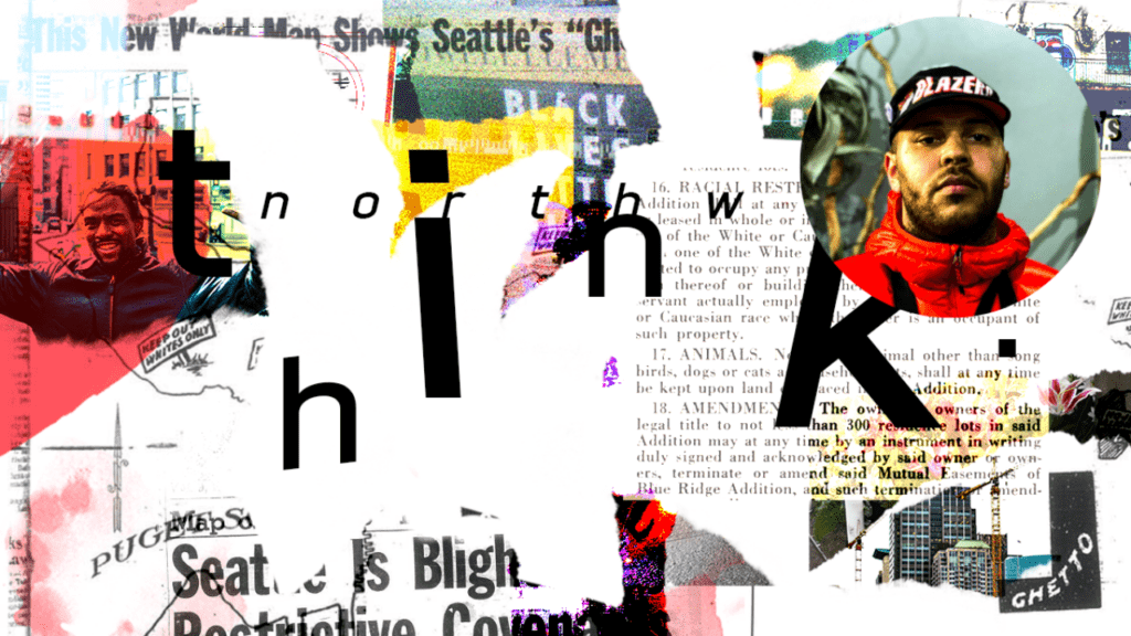
September 2022 Logo Remix: John Mujica
Every month, we invite a new artist to take the ThinkNW logo and make it their own. We asked John Mujica, a freelancer (who designs under the name Johnny Xerox) and a full-time Graphic Design Instructor at Spokane Falls Community College, for his take on the September logo.
He describes himself as a “perfectly imperfect and creatively adorned mark maker, typographer, designer, and educator who thrives on using all experiences, both good and bad, as a pathway to learn, share with others, and make an impact in the communities I serve.”
How did you initially want to approach your interpretation of the ThinkNW logo? What were your thoughts and inspiration?
I wanted to use my love for typography and logo design to create a visual that was somewhat quirky and aesthetically pleasing to the eye, yet readable. The typographically driven solution I created is solid in my eyes. My inspiration came from the unique type of designs of designers past. Saul Bass comes to mind, as I love how his type was playful yet readable and professional.
How did the direction in designing the ThinkNW logo evolve/change over time?
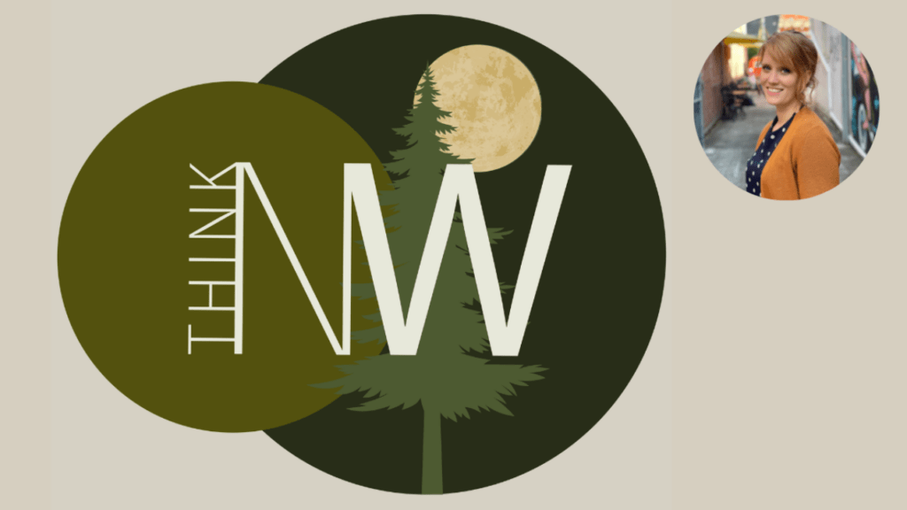
Originally, I wanted to create a typographical treatment that emphasized my love for blackletter type, but slowly realized it was too dark and that I wanted to really get to the heart of what the Northwest is about; a fun and forested place where we can all enjoy and recharge.
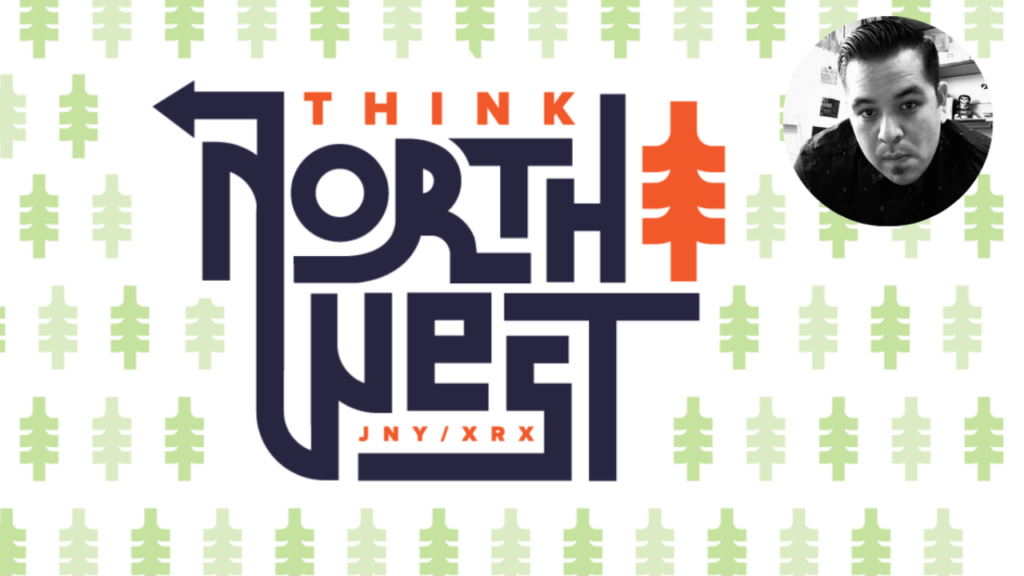
What are some of the specific elements in the ThinkNW logo design that you feel are unique/cool/fun (i.e., palette, illustration, overall style)?
I tried to integrate both typography and object into one unique whole. I chose to use the expanded name of “ThinkNW” into “Think Northwest” to be more playful with my type solution. The type and readability were more important than the elements within the piece but were still enough to emphasize the readability of the name vs. the element. I chose a modern monoline tree as the iconic element that represents the Northwest and created a pattern that would increase the integrity of the “brand.” For the colors, I wanted to have something that was vibrant.
When did you know that art was something that you wanted to pursue?
As a young and rebellious adolescent growing up in the subcultures of punk rock and skateboarding, I knew that I wanted to do something that showcased my skill through “commercial art” that also allowed me to express myself through type and illustration. It all started through hand-designing t-shirts and flyers/posters for friends’ bands and grew from there.
What are your biggest inspirations in your art (i.e., people, places, things)?
Sharing my passions with others and inspiring them to do the same has become key to my artistic, personal, and professional growth. I believe everyone is worth having them built up, and I want to set an example and encourage others to give back to the community and themselves.
Professionally, logo design has always been a passion, and I had followed the LogoLounge publication since I was a student. So, my biggest inspiration was meeting and befriending Bill Gardner of Gardner Design and LogoLounge. He was the keynote Collective Campout, an event I co-founded with my friend Jennifer Fanto, where I led the creative and art direction for four years. Bill is the most sincere person, always provides time for people, and will openly share his many years of wisdom with others. Since then, I’ve relied on him for motivation and advice about stepping into teaching. His words have been a comfort, and the reassurance he provided still helps me to this day. He has also spoken at club events for the program I teach and helped introduce a recent graduate who moved to Kansas to the market in Wichita. Great guy.
Places? Give me any beach, and I’m at home. I had the pleasure of living in La Maddalena on the Sardinian Islands of Italy for four years when I was in the Navy. We would practically live on the beach some of those days. But for some reason, something is energizing about the sand, the sun, and the sound of the ocean.
As for “things,” I would say the old ephemeral type design and printed material of years past. I love the history behind it, the thought and craftsmanship that went into making it, and how it relates to my time now. People have come and gone; our time here is short, so we need to make the best of it. If we fail one day, that’s okay; we also have tomorrow to try again.
But by far, my biggest inspiration would have to be my children. They bring the greatest joy to my life and motivate and push me to be someone I never thought I could be. Ultimately, I want to set a standard for them and my students that even though life may not be ideal, we can make a difference. I always say I don’t expect perfection, I expect effort.
Do you think that you have a style? If so, how would you describe it? If not, why is that? Y
es and no. I’m mostly known for my logos and typography, but I would like to think I am a versatile type designer who can adapt to any environment and any client I may work with. I don’t know if that is traditionally acceptable or not, but I take it anyway.
What is most important to you when expressing your art?
Perseverance. This applies to life as well. If you get stuck, don’t like it, or question everything, don’t be discouraged. Do what you need to get past the challenge. Get feedback from others, don’t dwell or talk negatively about it, and find ways to persevere through it. It builds character and wisdom.
Where do you feel your art is going next?
Hopefully, into the hearts and minds of my children, my students, or the community I serve.
Learn more about John Mujica and his work: