November 2022 Logo Remix: Rachel Amaro

Every month, we invite a new artist to take the ThinkNW logo and make it their own. We asked Rachel Amaro, a Graphic Designer in Portland, Oregon, for her take on the November logo.
How did you initially want to approach your interpretation of the ThinkNW logo? What were your thoughts and inspiration?
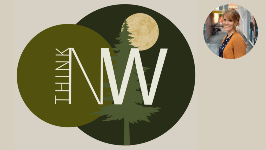
My first idea was to go with what I love: a simple, clean logo that used type design as the main feature and a simple shape to add a touch of color. This is always harder than it sounds, but I think I kept from straying too far from my original concept. I drew inspiration from the think bubbles in the original logo and wanted to incorporate them into my final design.
I also drew a lot of inspiration from the sometimes untold colors of the night in the PNW. My mind wandered to brisk nights driving out toward the coast of Oregon, through the deep dark pines that would break to show a clear night sky. The colors of the night are different here in the PNW than anywhere else I have been in the world. I knew I wanted to stay with the earth tones that usually represent the PNW well, but to use the shadowed versions that can only be found glowing under the light of the moon at night.
How did the direction in designing the ThinkNW logo evolve/change over time?
After nailing down the type design, I created several backdrops. I began with using a tree grove, then a shadowed tree backdrop, but these felt so expected. I finally landed on using three circles as a nod to the original logo’s think bubbles, while also creating a different look altogether. As I played with layering the colors, I ended up steering a little bit away from clean and simple and added a bit of texture to create a moon effect. I like to push the boundaries on what is “allowed” in design, so adding just one element with texture did that here.
What are some of the specific elements in the ThinkNW logo design that you feel are unique/cool/fun (i.e., palette, illustration, overall style)?
I like to think that my style is kind of unique, although we all find inspiration from somewhere. Creating clean and simple design can actually be quite difficult. I had fun challenging myself not to keep adding elements, but to find a way to create an eye-catching, simple design.
When did you know that art was something that you wanted to pursue?
I’ve always been “Artsy” and seen the world a little different than other people. While music was a strong point for me, actually getting my hands to create what was in my mind’s eye was often a challenge. I’ve always been pretty great with learning and doing things on the computer, so when I met my partner and started learning what he was doing with Graphic Design, I immediately realized that THIS is where I could start creating my vision. A few classes and internships later I had a degree, and now I love my job! I love working with people to find out what they are envisioning, and creating a space to meld my style to their vision. The endless need for problem solving keeps my mind sharp, and pushes me to keep learning.
What are your biggest inspirations in your art (i.e., people, places, things)?
Honestly, everything around me inspires me. Nature, the earth, and the air around me, as well as people, are always points of inspiration for me. There are so many things to see on a simple 10-minute walk around your neighborhood, so whenever I need fresh inspiration, I go for a walk.
After diving deep into the history of type design and logo design, I realized that it has always inspired me, even if it’s just to choose one item over another. I often visit the local farmer’s market to explore logo design and ask the creators about the inspiration behind their own creations. I find that the story behind a logo often inspires me to find new and creative ways to help clients express their vision in a logo.
One of my amazing teachers, LoveJoy Paradise, taught us to look at least 100 good/great pieces of art a day to keep ourselves inspired and to continue growing in style and ability. Often, seeing other designers’ work inspires me to push myself to create new and fresh designs.
I love working as a team, so reaching over to nudge my husband Fernando, who has an incredible eye for design, always leads to more creative conversations and ideas that push my design a little further. I am a big believer in critique and creative collaboration!
Do you think that you have a style? If so, how would you describe it? If not, why is that?
I really enjoy creating clean and simple, eye-catching designs. However, I believe I am capable of executing many different styles and enjoy pushing myself into something new and uncomfortable with each new client and design.
What is most important to you when expressing your art?
Staying true to what I know and believe. I have a good eye for design and a solid understanding of how to communicate through design. I try not to let outside voices drown out my own truth.
I also have a strict stance against imitation, mimicking, and knock-offs. My designs will always be original, and while they may draw inspiration from other ideas and incorporate certain elements, I will never pass off someone else’s work as my own.
Where do you feel your art is going next?
I hope to continue growing in my craft and eventually move into teaching what I know, whether in a formal setting such as a school or as a Graphic Design Director in the real world. I want to help other artists have the opportunity to grow and thrive while doing what they love!
Learn more about Rachel Amaro and her work:


