August 2022 Logo Remix: Levi Larson

Every month, we invite a new artist to take the ThinkNW logo and make it their own. We asked Levi Larson, a graphic designer & illustrator based in Vancouver, Washington, for his take on the August logo.
How did you initially want to approach your interpretation of the ThinkNW logo? What were your thoughts and inspiration?
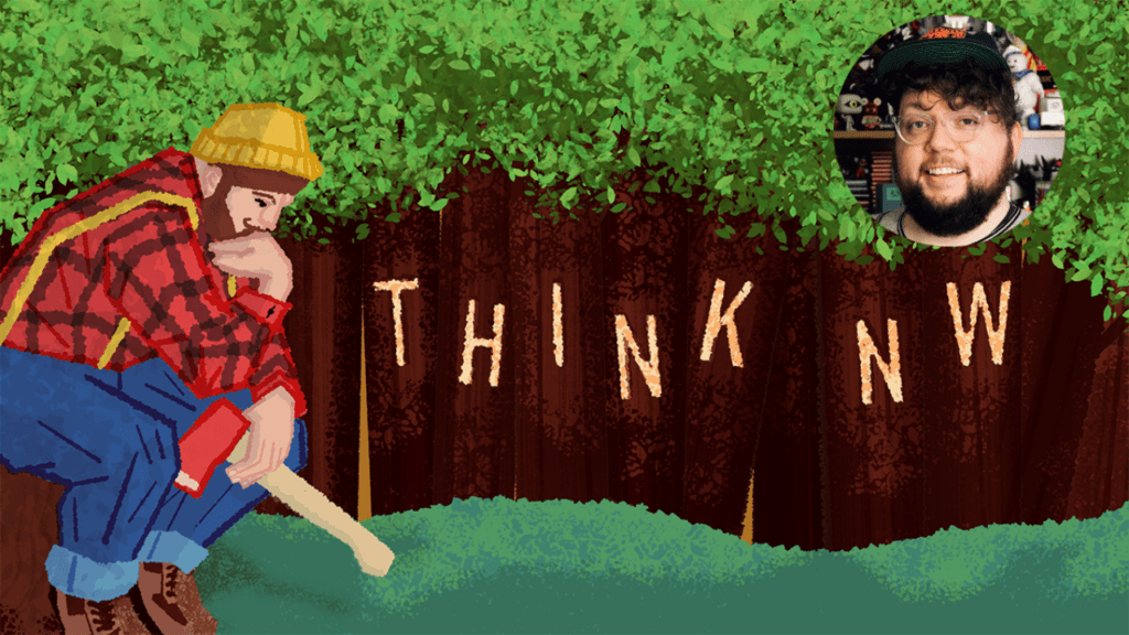
I knew that I wanted to feature trees and a lumberjack almost instantly. I have a fondness for Americana and the illustration styles of the 50’s and 60’s, and I knew that a lumberjack in that style would be fitting and was something that to me will always make me think of the northwest. I also chose to reference Auguste Rodin’s sculpture, “The Thinker” in the lumberjack’s pose.
How did you initially want to approach your interpretation of the ThinkNW logo? What were your thoughts and inspiration?
I sketched out a couple of different compositions initially. I thought I may have the Lumberjack standing or in mid-swing. At one point, I had “Think NW” carved into a fallen tree, but I thought that may have been taken as a bit of a foreboding omen.
What are some of the specific elements in the ThinkNW logo design that you feel are unique/cool/fun (i.e., palette, illustration, overall style)?
I think the use of texture and the illustration style work well together and make me think of some of the old children’s books that I grew up on and helped instill a love of art in me at a young age.
When did you know that art was something that you wanted to pursue?
I think I always knew that I was going to grow up to do something related to art. From the start, my parents encouraged me to be creative and to use my imagination. My dad helped me make costumes from paper bags, and my mom dressed me in colorful clothes (my favorite was a jacket that made me look like a dinosaur) and cheered on my spontaneous performances from behind our old home video camera. I spent a decade doing theater and improv with the Pacific Northwest-based theater company Journey Theater during my middle school and teen years. It was during this time I became interested in design and was introduced to Journey’s graphic designer and illustrator, Jon Jacquet, who became a reliable mentor and a great friend.
What are your biggest inspirations in your art (i.e., people, places, things)?
I find inspiration everywhere. It is not uncommon for me to snap photos of logos in elevators or to hang onto clothing tags that I found particularly well-designed. I collect sneakers, toys, and games, all things that I enjoy and that inspire my creativity. As for people, I follow many talented designers and illustrators, the most influential on my own work being Seattle’s own Invisible Creature.
Do you think that you have a style? If so, how would you describe it? If not, why is that?
I wouldn’t say that I have a clearly defined style, at least not yet. I do believe my work is constantly evolving and improving, and I may very well be honing it toward some defined style in the future. For now, however, I find a lot of value in my ability to approach projects from multiple different styles/angles. It’s probably cliché to say, but I like to think of myself as a creative Swiss Army knife.
What is most important to you when expressing your art?
Having fun and trying new things!
Where do you feel your art is going next?
I’ve spent about 10 years growing my skills as a designer, while I’ve really only started putting a focus on improving my skills as an illustrator in the past year or so. Because of this, there is a separation between both skill sets in my brain.
Learn more about Levi Larson and his work:


