Creative Showcase: Trump Against Trump AR Campaign


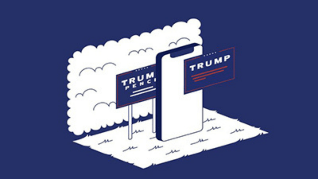
An international group of design students and activists joined forces to create an AR filter that changes messaging on Donald Trump campaign signs. The Portland Ad Fed caught up with the Trump Against Trump team to chat about their work.
1. Tell me a little but about your backgrounds and how you all came to work with each other. What’s your origin story?
There’s no radioactive spider involved, but it nevertheless is a complex web of connections. The seven of us include ad students, recent graduates and young professionals – a creative technologist, a UX/UI designer, two art directors, two copywriters and a soon-to-be lawyer. Some went to school together, some worked together and some who still haven’t met in person. The team was strictly assembled on, ‘I know a guy’ basis.
2. What inspired this project and what is the message?
We are not all Americans, but Trump’s policies have far-reaching consequences. There were already a lot of projects that were encouraging people to vote him out. We wanted to make our own dent. We came across a Knight Foundation report that highlighted how, in 2016, nearly 100 million Americans did not cast a vote for president. The two main reasons that non-voters were quoted for their inaction were lack of information about candidates and the belief that the outcome won’t affect their lives in any possible way. We wanted to encourage these non-voters and fence-sitters to vote by informing them howTrump’s policies had affected their state and would eventually affect them too.
3. How did you land on making this an AR experience?
In our research, we discovered that most non-voters got their political fix from entertainment outlets. We’ve always perceived Augmented Reality as a potent party trick – but it can educate and entertain at the same time.
4. Your team is very spread out. Did that make collaboration a challenge? What tools did you use to coordinate the work?
It definitely was a challenge because we started this project during the very first lockdown in Europe. While the intent was always at 100%, the enthusiasm often dwindled. Being stuck at home wasn’t doing us any favors creatively. We started slow, with one video call a week across two time zones. Gradually, as we got a hang of working from home, we started collaborating across G-suite, Figma and, of course, the quintessential WhatsApp group.
5. Was there any fear in turning off possible clients or partners by being “too political?”
We never factored this in when we started on the project. We simply believed that everyone who’s against Trump will have no problem picking up our story or sharing it. That quickly changed after we actually started reaching out to people. A lot of outlets were impressed by the idea and backed it wholeheartedly, but did not publish it because of their need to stay neutral.
6. What part of this work are you most proud of?
On the day of the result, we heard from a couple of families in Pennsylvania who told us that they went and voted because of our filter. We believe this, as small as it sounds, was our biggest success.
Team
Creative technologist: Luc Palombo
Front-end developer: Choi So-Young
Art directors: Bui Nhi, Kai West Schlosser
Copywriters: Swarna Thomas, Rasesh Patkar
Legal co-ordinator: Simon Ruhland


